This paper presents a relatively simple machine learning model designed to forecast the likelihood of a U.S. recession within a six-month horizon, and its results suggest a low probability of an imminent economic downturn.
None the less, a lot can happen in a few months and no model is perfect. Read more about how the model was designed below.

For this machine learning model that has been developed, the data used is of each month from 01/01/1999 to 07/01/2025, these are 319 observations. The 13 features used for the model are the following: VIX, the yield spread between 10 year and 2 year US treasury bonds, the actual yield of the 10 year US treasury bond keeping in account of the inflation, the spread between the Moody’s Seasoned BAA Corporate Bond Yield and the 10 year treasury bond, housing starts total units in whole numbers, how many building permits were given in whole numbers, the unemployment rate, initial claims for unemployment benefits in whole numbers, the Purchase Manufacturing Index (PMI), Conference Board Leading Economic Index, the 6 month change in percentage of oil prices, the copper/gold ratio and the core inflation rate. These were chosen as they are few of the most common available and practical to use features.
The VIX is widely cited as a key indicator for forecasting recessions, it is a measure of the stock market’s expectation of volatility based on S&P 500 index options. If it goes up this means more volatility expected and a higher chance on a recession[i].
The yield spread between 10 year and 2 year treasury bonds[ii][iii], so the average yield what you would get from a 10 year treasury bond minus the yield you would be getting from a 2 year treasury yield, an inverted yield curve (so when the return of a 2 year treasury bond is higher than a 10 year bond) is often considered a bad ohm, looking at the last 2 months of data in the dataset so May till July 2025 it actually went up! Which can be considered a good sign.
Another common indicator used is the spread between Moody’s Seasoned BAA Corporate Bond Yield[iv] and the 10 year treasury yield. It is calculated by subtracting both factors. The result of this measures credit risk and market sediment, it shows how much investors are willing to take risk, the wider the spread over time, the more risk averse investors become.
The housing starts total units[v] indicator show how many residential units of all kind started construction at a particular date. It signals future economic activity, as it requires a long chain of events to finish (e.g. hiring construction workers, buying materials etc.). A decrease in housing starts suggests that builders and investors anticipate a slowdown in demand, leading them to pull back on new projects. Last 5 month data from March to July showed a slight decline.
The amount of building permits[vi] given out, is a good indicator for consumer confidence and solvency. A decline shows that builders anticipate a slowdown in demand, rising costs, or a weakening economy. An increase suggests optimism and a believe that the economy is strengthening. Last months the amount of building permits are lower.
The unemployment rate[vii] is a rather obvious one, the higher unemployment rate climbs over time it means that there is a higher risk of a recession, less jobs are available so people have less to spend. The unemployment rate is on the rise, but can still be considered low with around 4%.
The initial claims[viii], this tracks the number of new unemployment insurance claims filed by individuals who have recently lost their job. Reported weekly, but for this model we took the monthly amount. A higher than expected amount indicates potential declining economic conditions. March to July there was no mayor jump.
The Purchasing Managers’ Index (PMI)[ix] measures the future confidence of businesses and provides a forward-looking snapshot of economic activity. Above 50 means manufacturing and services industry is expending and below 50 it is contracting. From March till July it was just below 50 moving around the 48.5.
The Leading index for the United States[x] from the Fed, is similar to the Conference Board Leading Economic Index (LEI). With this index, the reference year 2016 is used. It declines over time when a recession is nearing and increases when the economy is expanding. The index is designed from the following components: nonfarm payroll employment, average hours worked in manufacturing by production workers, the unemployment rate, the sum of wages and salaries with proprietors’ income (two components of personal income) deflated by the consumer price index (U.S. city average), state-level housing permits (1 to 4 units), state initial unemployment insurance claims, delivery times from the Institute for Supply Management (ISM) manufacturing survey, and the interest rate spread between the 10-year Treasury bond and the 3-month Treasury bill. From March to July there was a minor decline visible of this indicator.
The six month change in oil prices in percentages this is a good indicator as it shows the difference between the oil price of one month and compares it with the oil price of 6 months ago. Here the WTI crude oil data is used[xi]. Oil is a good indicator about how well a economy is doing. As oil is a significant expense for consumers a too .A significant change over a 6-month period can often precede official economic data releases. Last 5 months from March to July the oil prices decreased on average with 8%.
The copper/gold ratio[xii][xiii], this measures the difference between the copper price and gold price. A ratio that is decreasing over time is a bad sign, as investors are more looking for safe heaven assets such as gold. Instead of copper, which is more related with economic growth and construction. The latest months available of this year shows a decreasing ratio.
Core inflation[xiv], this is the inflation less energy and food. This shows the inflation of goods and services over time, a high inflation is bad for an economy as money and thus salaries of people become less worth over time. Recent months as everyone sure as noticed, the inflation has been higher than the usual targeted 2%, last reading from March till July 2025 the inflation was around 3%.
Looking at the model itself. It is a walk-forward back test, which is a powerful technique for time series. It was decided to use 8 folds as this makes the model more reliable and stable. The first training data set has 50% of the observations. The purpose of this method is to always use all available historical data to train the model, and prevents look-ahead bias. Which simply means it does not try to use data which is not available in real-time.
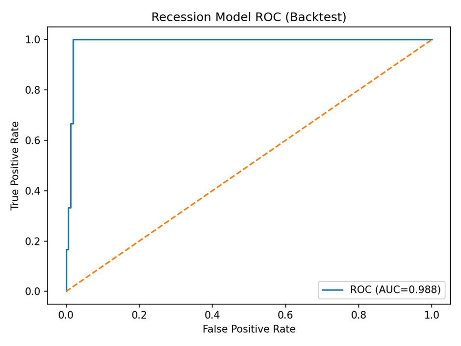
The result of this model with these conditions? A precision of 0.667 indicates that the model’s positive predictions of a recession were correct 66.7% of the time. A ROC AUC score of 0.988 (see graph below) meaning it can identify between a recession or not a recession within 6 months, where 1.0 is the highest. A F1 score of 0.800, where 1.0 is the highest possible. Basically, it is a strong indication that the model is performing well. A good balance is found where the model is confident in its predictions (high precision) while still managing to catch a significant number of the actual recessions (good recall). By using the harmonic mean of precision and recall. Most likely no recession is on the horizon the next +/- 6 months.
Potential avenues for future research, is to increase the number of observations of non-recession months and recession months, as this will likely increase the precision level. An additional avenue for improvement is the incorporation of a larger feature set, add less commonly used indicators such as the Cass Freight Index: Shipments, or PPI (Producer Price Index) also available on the FRED database. Another useful index is the BDI (Baltic Dry Index) available on Bloomberg. Increasing the amount of features however can and will likely decrease the precision and other measurements. A big drawback of this research is that many of the data that is needed is often gathered by non-governmental organizations, requiring you to pay for the highest quality data. In the end the model is only as good as the available data it is trained on.
[i] https://fred.stlouisfed.org/series/VIXCLS
[ii] https://fred.stlouisfed.org/series/DGS2
[iii] https://fred.stlouisfed.org/series/DGS10
[iv] https://fred.stlouisfed.org/series/BAA
[v] https://fred.stlouisfed.org/series/HOUST
[vi] https://fred.stlouisfed.org/series/PERMIT
[vii] https://fred.stlouisfed.org/series/UNRATE
[viii] https://fred.stlouisfed.org/series/ICSA
[ix] https://en.macromicro.me/charts/54/ism
[x] https://fred.stlouisfed.org/series/USSLIND
[xi] https://fred.stlouisfed.org/series/DCOILWTICO
[xii] https://fred.stlouisfed.org/series/PCOPPUSDM
[xiii] https://www.macrotrends.net/1333/historical-gold-prices-100-year-chart